When designing a new logo, graphics for advertising, or rebranding for your company, one of the most important things to remember is that your design will leave an impression on your customers. The colors, images, style, and font all work together to create a cohesive design that illustrates what the company is, an illustration that will influence how customers perceive it. While these are all important elements of designing and rebranding, font and different styles do the most work in grabbing someone’s attention and not letting go.
We have all scrolled through all of the fonts listed in Microsoft Word or other applications. The list seems endless and makes it almost impossible to choose just one for your design. Luckily, there are some tips, tricks, and rules to help you narrow down your font choice to make your design pop.
Plenty of crazy fonts exist in the world of writing and design that most people would never go near (the dreaded “Wingdings” comes to mind here), but there are some fonts that can draw you in because of uniqueness and fanciness. It’s important to remember that the safer the font, the better. This means choosing a font that is clear and legible so that no one has trouble deciphering what the text is saying. You want to grab a customer’s attention and keep it; with a crazy or wild font that is difficult to read, they may give up and disregard your logo or graphic.
There are five “families” of fonts: Geometric, Humanist, Old Style, Transitional and Modern, Slab Serif. These classifications make up about 20% of all fonts, but are used in 80% of all writing and design, so sticking with fonts in these families will help you continue to narrow down your choice that best fits your idea. Geometric fonts are, as the name suggest, based in geometric forms. The letters are uniform in width and length and take a more minimalistic approach in design. These fonts include Helvetica, Univers, Futura, Avant Garde, Akzidenz Grotesk, Franklin Gothic, and Gotham.
The Humanist family are clean and modern, but are influenced more by handwriting. They are simple and are meant to mimic our handwriting strokes, offering a “human touch” to design and writing. Humanist fonts include Gill Sans, Frutiger, Myriad, Optima, and Verdana.
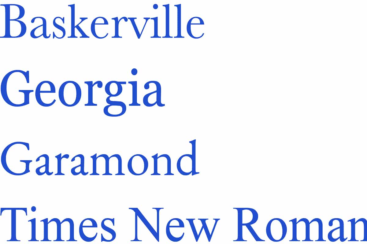
Old Style is exactly in the name: influenced by older styles. These are clear, easy to read, and have a traditional style to them. Old Style fonts include Jenson, Bembo, Palatino, and Garamond.
Transitional and Modern typefaces are grouped together because they are both classified as strong, sleek, and stylish, and offer a timeless look that doesn’t go out of style. Examples of these are Times New Roman and Baskerville for Transitional fonts, and Bodoni and Didot for Modern ones.
Lastly, Slab Serif fonts have grown more popular throughout the years for their versatility. They can fit into more rural spaces easily, while moving into urban spaces just as seemlessly. These fonts include Clarendon, Rockwell, Courier, Lubalin Graph, and Archer.
So now that you know the different font styles at your disposal, choosing a font that best fits the atmosphere of your brand is a little bit easier. Are you wanting a more modern, sleek look for your advertisements? Or does a more old school, classic font best fit your style? No matter your style, there are plenty of fonts available to help make your designs stand out.
So you’ve chosen your fonts and it’s time to put your design together; now what? There are plenty of rules in the design world, but when it comes to fonts, it’s important to remember the following rules.
1. Different fonts have different purposes and placements
While there are so many different fonts that you can choose, certain fonts will only work effectively in certain placements. For fonts that are display fonts, meaning ones that are more playful and attention-grabbing, use them as headers to set the tone of your company, advertisement, or product. Fonts that are easier to read and have a classic tone to them may work better as body text, while fonts that are clean and sleek may look great as headers or titles.
2. When putting two or more fonts together, contrast
Using multiple fonts can make your design unique and bold. If you decide to use two or more, make sure that you are using two fonts that are contrasting in nature. Of course, not all fonts will look good together, but there are ways to know whether two fonts will look good together: if they are a similar height, if they come from the same time period, or if they were designed by the same person.
3. Align everything
Making sure that your headers, body, and titles are all aligned is vital for a well designed logo or image. If the alignment is off, people may consider the design sloppy and lose attention fast. Checking to see if the fonts are lined up on the same vertical axis, the same amount of space is allowed between lines and sections, and the beginning and end of lines are the same will keep your design clean and legible.
Whatever your design is, there is a font and style that works best for you. So give these rules and styles a try next time you have to design a new logo, an advertisement, business cards, stationary, or more for your business. All of these elements work together to make your design stand out among the crowd.


